网页中实现正六边形的N种姿势

前端工程师
经常在别人家的网页上看到各中好看图形,其中就有正六边形和组合的蜂窝状图形。今天我们来盘点一下,网页上有哪些姿势实现这个效果
姿势1
css的border
/*css*/
.lb01 {
	position: relative;
	width: 200px;
	height: 120px;
	background-color: red;
	margin: 100px;
}
.lb01:after {
	content: "";
	position: absolute;
	display: block;
	top: -160px;
	width: 0;
	height: 0;
	border: 100px solid transparent;
	border-bottom: 60px solid red;
}
.lb01:before {
	content: "";
	position: absolute;
	display: block;
	bottom: -160px;
	width: 0;
	height: 0;
	border: 100px solid transparent;
	border-top: 60px solid red;
}<div class="lb01"></div>
效果如图:

姿势2
css3的transform
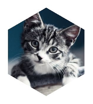
.lb02 {
	width: 260px;
	height: 300px;
	margin: 50px;
	-webkit-transform: rotate(60deg);
	overflow: hidden;
}
.lb02 div,
.lb02 img {
	width: 100%;
	height: 100%;
	overflow: hidden;
}

.lb02> div {
	-webkit-transform: rotate(-120deg);
}

.lb02> div> div {
	-webkit-transform: rotate(60deg);
}
<div class="lb02">
	<div>
		<div>
			<img src="000.png" />
		</div>
	</div>
</div>
效果如图:
姿势3
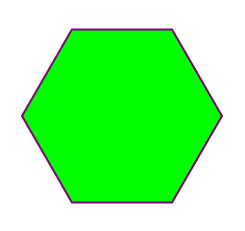
svg的多边形
<svg viewbox="0,0,400,400" width="400" height="400">
	<polygon
		points="300.0000,200.0000
		250.0000,113.3975
		150.0000,113.3975
		100.0000,200.0000
		150.0000,286.6025
		250.0000,286.6025"
		style="fill:lime;
			stroke:purple;
			stroke-width:2" />
</svg>
效果图:
什么?你问我上面的坐标点怎么得到的?肯定是写一点代码算出来的呀,难道手写?具体怎么算可以参考下一种方式中的代码.
姿势4
canvas绘图
var canvas = document.getElementById("canvas");
	canvas.width = 400;
	canvas.height = 400;
var cc = canvas.getContext("2d");

// 填充一个背景
cc.fillStyle = "#31a6e2";
cc.rect(0 , 0 , 400 , 400);
cc.fill();

cc.beginPath();
for (var i = 0 ; i < 6 ; i++) {
	var x =  Math.cos((i * 60)/180 * Math.PI) * 150 + 200 ;
	var y = -Math.sin((i * 60)/180 * Math.PI) * 150 + 200;
	cc.lineTo(x,y);
}
cc.closePath();

cc.lineWidth = 2;
cc.fillStyle = "#fc3598";
cc.fill();
<canvas id="canvas"></canvas>
效果图:

然后我们用六边形玩点有意思的:如图
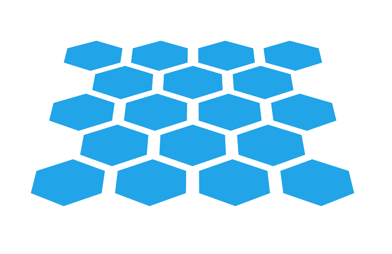

代码如下:
<!DOCTYPE html>
<html>
	<head>
		<meta charset="UTF-8">
		<title></title>

		<style type="text/css">
			#test {
				width: 850px;
				padding: 100px;
				height: 800px;
				margin: 0 auto;
				border: 1px solid red;
				-webkit-perspective: 1920px;
    			-webkit-transform-origin: 50% 30% 600px;
    			overflow: hidden;
			}

			ul {
				-webkit-transform-style: preserve-3d;
   				-webkit-transform: rotateX(60deg);
			}

			ul:after {
				content: "";
				display: block;
				clear: both;
			}

			ul li {
				position: relative;
				float: left;
				width: 90px;
				height: 160px;
				list-style: none;
				margin: 0px 50px;
				background-color: #21a4e8;
				-webkit-transform: rotate(90deg);
			}
			ul li:after {
				content: "";
				display: block;
				position: absolute;
				top: 0;
				right: 100%;
				border-style: solid;
				border: 80px solid transparent;
				border-width: 80px 50px;
				border-right-color: #21a4e8;
			}
			ul li:before {
				content: "";
				display: block;
				position: absolute;
				top: 0;
				left: 100%;
				border-style: solid;
				border: 80px solid transparent;
				border-width: 80px 50px;
				border-left-color: #21a4e8;
			}
			.dob {
				margin-left: 145px;
			}

		</style>

	</head>
	<body>
		<div id="test">
			<ul>
				<li></li>
				<li></li>
				<li></li>
				<li></li>
				<li class="dob"></li>
				<li></li>
				<li></li>
				<li></li>
				<li></li>
				<li></li>
				<li></li>
				<li class="dob"></li>
				<li></li>
				<li></li>
				<li></li>
				<li></li>
				<li></li>
				<li></li>
			</ul>

		</div>
	</body>
</html>
当然,你也发挥你的聪明才智,玩点更有意思的。如果你有新的写六边形的方式,也欢迎你补充!
编辑于 2016-12-21 19:54