
这么牛X的包,一般人我不告诉他!!!

本文将给大家介绍一个ggplot2灰常牛X的可视化扩展包,我将该包主页的包用法介绍整理成中文,分享给大家。
包名叫geofacet,有经验的charter大概能猜出来个大概,没错该包是关于可视化数据中的地理信息,以及维度分面。
作者命名非常讲究,将该包的两个主要核心功能进行组合命名。
地理信息可视化分面,这么吊的包你肯定是第一次看到吧(其实之前介绍过一些地图上的mini 柱形图、饼图等都算这一类),但是这里的分面功能做的更加彻底,作者还是遵循惯例,将这种基于地理信息分面的可视化功能对接了ggplot2,并以分面函数facet_geo()的形式呈现。
这样了解ggplot2的用户学习成本就低了很多,因为只需了解这个分面参数的具体设定,组织对应数据源格式就OK了。
以下是本文的主要内容:
geofacet包扩展了ggplot2的分面函数,进而提供了基于地理信息的更加灵活的数据可视化方案。这个分面函数并无特别指出,如同内置的分面函数(facet_grid、facet_wrap等)用法没有太大差别。唯一的区别是,在最终的图形版面呈现结果上,允许单个图表分面刻画在对应的地理多边形中心位置。
该包的核心功能可以概括为以下几点:
每一个分面单元格都可以呈现一个维度的数据(而非单个数值);
每一个分面单元格可以容纳任何一种ggplot2内置图表对象(看清楚了,是任何一种,任何一种,任何一种,就问你这包屌不屌!);
分面系统支持任何的地理多边形(可以是内建的,也可以是用户自定义的)。
该包的强大优势绝不仅仅只有以下展示的这些内容,很快我们将会建立一个该包的专属博客(如果建好了会将其网站分享在本页面)。
下载安装:
install.packages("geofacet")
# or from github:
# devtools::install_github("hafen/geofacet")
library(geofacet)
library(ggplot2)
library(ggthemes)
使用方法:
该包内的主要函数是facet_geo(),它的用法可以类比ggplot2的内置分面函数facet_warp()\facet_grid()(当然在输出方式上略有不同)。只要你已经熟练掌握了ggplot2语法,那么你就可以轻松搞定这个包。
接下来让我们展示一个例子,该包内置了一个数据集——state_ranks。
head(state_ranks)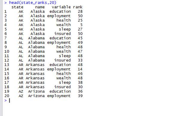

这是一个包含美国各州不同社会指标优略程度的数据集(按照排名由低到高排序)。
然后让我们使用geofacet来给每一个州都创造一个柱形图,我仅需使用一个ggplot2内的geom_col()函数即可,至于分面参数,这里我们摒弃使用传统的facet_wrap()分面函数,而是使用geofacet包提供的facet_geo()函数来替代。
定义一个主题:
mytheme<-function (base_size = 12, base_family = ""){
    theme_bw(base_size = base_size, base_family = base_family) %+replace%
    theme(axis.line = element_blank(), axis.text.x=element_blank(),
          axis.ticks=element_blank(), axis.title = element_blank(),
          panel.background=element_blank(),panel.border =element_blank(),
          panel.grid = element_blank(), plot.background = element_blank(),
          strip.background=element_blank(),legend.position = c(0.9,0.15))
}
分面柱形图:
ggplot(state_ranks, aes(variable,rank,fill=variable)) +
  geom_col() +
  coord_flip() +
  scale_fill_wsj()+
  facet_geo(~state)+
  mytheme()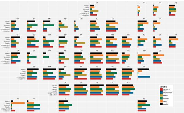

geofacet内部重要参数:
grid参数:可以理解为网格id,可以选择内建的id名称,或者是提供一个自建的已经命名有网格名称的数据框。
label参数:可以指定任何我们想要指定的变量作为网格显示的标签。
以下是两一个自带数据集的例子:
head(us_state_grid2)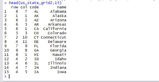

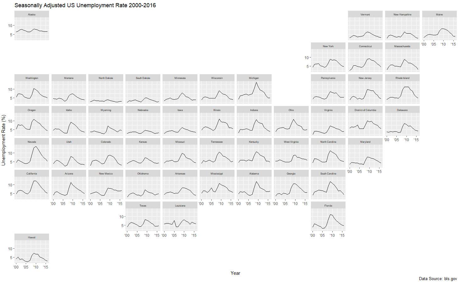
这一次,我们用来呈现美国季节调整后的失业率随时间的变化。使用对应州名作为对应网格标签。
ggplot(state_unemp, aes(year, rate)) +
  geom_line() +
  facet_geo(~ state, grid = "us_state_grid2", label = "name") +
  scale_x_continuous(labels = function(x) paste0("'", substr(x, 3, 4))) +
  labs(title = "Seasonally Adjusted US Unemployment Rate 2000-2016",
    caption = "Data Source: bls.gov",
    x = "Year",
    y = "Unemployment Rate (%)") +
  theme(strip.text.x = element_text(size = 6))
指定网格非常容易,我们只需提供一个内含地区名称和地区代码的数据框即可。
ggplot(eu_gdp, aes(year, gdp_pc)) +
  geom_line(color = "steelblue") +
  facet_geo(~ name, grid = "eu_grid1", scales = "free_y") +
  scale_x_continuous(labels = function(x) paste0("'", substr(x, 3, 4))) +
  ylab("GDP Per Capita in Relation to EU Index (100)") +
  theme_bw()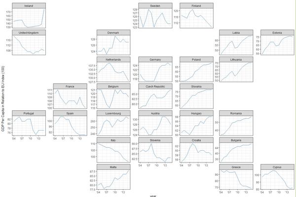
以下是该包内已经内建好的,我们画图可利用的带地区编码的数据集。
get_grid_names()[1] "us_state_grid1" "us_state_grid2" "eu_grid1" "aus_grid1" "sa_prov_grid1" "london_boroughs_grid"
[7] "nhs_scot_grid" "india_grid1" "india_grid2" "argentina_grid1" "br_grid1"
OMG,WAKM ,竟然没有China,这不科学啊(等我弄明白了我亲自给大家做一个)。
接下来是其他国家的几个例子!
#欧盟成员国GDP增长情况:
ggplot(aus_pop, aes(age_group, pop / 1e6, fill = age_group)) +
geom_col() +
facet_geo(~ code, grid = "aus_grid1") +
coord_flip() +
labs(
title = "Australian Population Breakdown",
caption = "Data Source: ABS Labour Force Survey, 12 month average",
y = "Population [Millions]") +
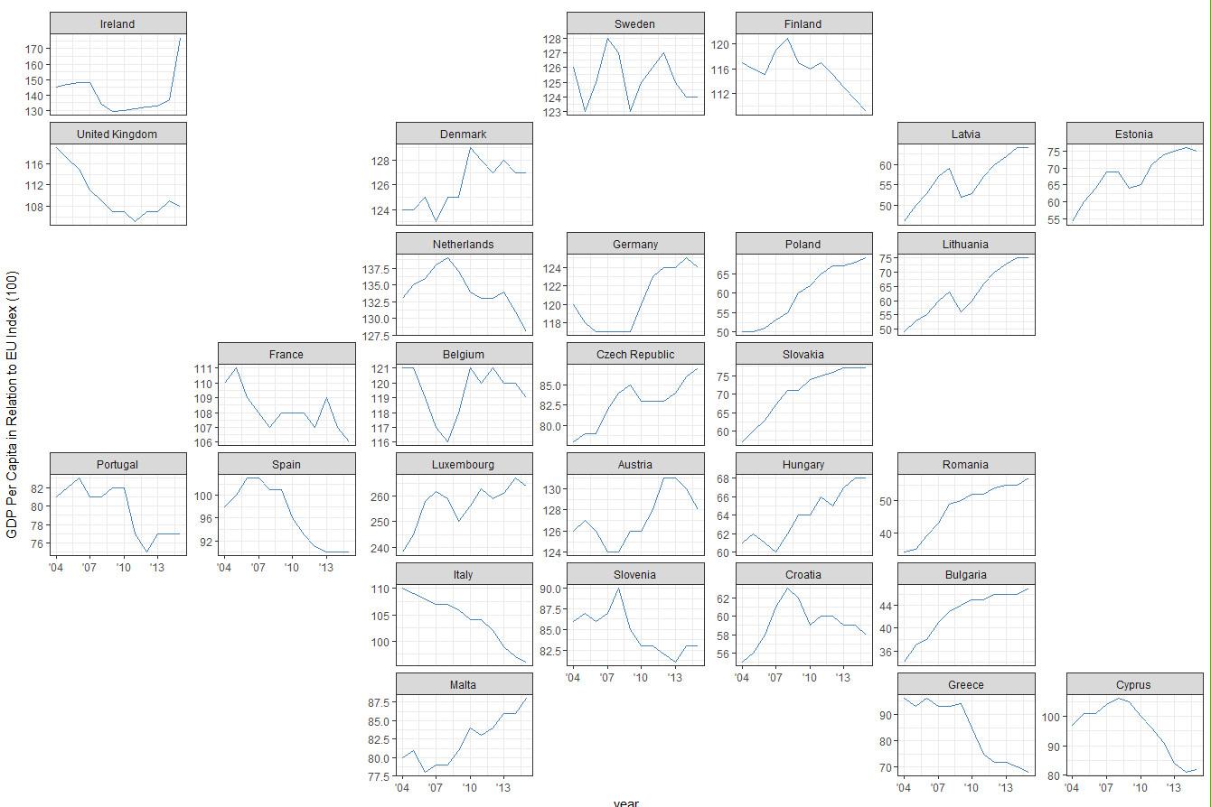
theme_bw()#奥地利人口分组可视化:
ggplot(aus_pop, aes(age_group, pop / 1e6, fill = age_group)) +
geom_col() +
facet_geo(~ code, grid = "aus_grid1") +
coord_flip() +
labs(    title = "Australian Population Breakdown",    caption = "Data Source: ABS Labour Force Survey, 12 month average",    y = "Population [Millions]") +
theme_bw()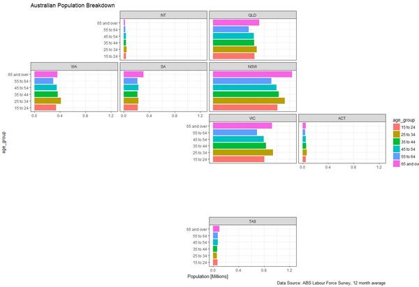

#南非
ggplot(sa_pop_dens, aes(factor(year), density, fill = factor(year))) +
  geom_col() +
  facet_geo(~ province, grid = "sa_prov_grid1") +
  labs(title = "South Africa population density by province",
    caption = "Data Source: Statistics SA Census",
    y = "Population density per square km") +
  theme_bw()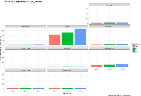

#关于伦敦房价
ggplot(london_afford, aes(x = year, y = starts, fill = year)) +
  geom_col(position = position_dodge()) +
  facet_geo(~ code, grid = "london_boroughs_grid", label = "name") +
  labs(title = "Affordable Housing Starts in London",
    subtitle = "Each Borough, 2015-16 to 2016-17",
    caption = "Source: London Datastore", x = "", y = "")

ggplot(nhs_scot_dental, aes(x = year, y = percent)) +
  geom_line() +
  facet_geo(~ name, grid = "nhs_scot_grid") +
  scale_x_continuous(breaks = c(2004, 2007, 2010, 2013)) +
  scale_y_continuous(breaks = c(40, 60, 80)) +
  labs(title = "Child Dental Health in Scotland",
    subtitle = "Percentage of P1 children in Scotland with no obvious decay experience.",
    caption = "Source: statistics.gov.scot", x = "", y = "")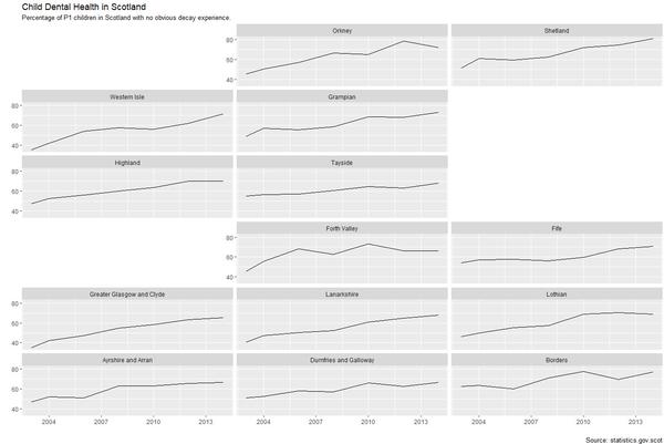

#印度人口分布
ggplot(subset(india_pop, type == "state"),
  aes(pop_type, value / 1e6, fill = pop_type)) +
  geom_col() +
  facet_geo(~ name, grid = "india_grid2", label = "code") +
  labs(title = "Indian Population Breakdown",
       caption = "Data Source: Wikipedia",
       x = "",
       y = "Population [Millions]") +
  theme_bw() +
  theme(axis.text.x = element_text(angle = 40, hjust = 1))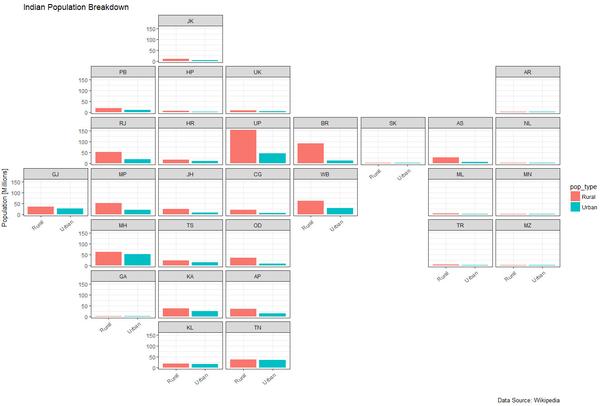

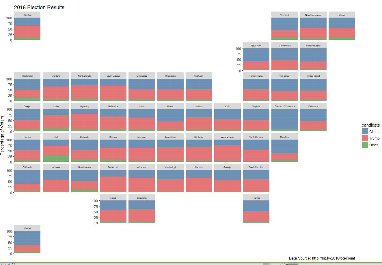
2016年美国总统大选:
ggplot(election, aes("", pct, fill = candidate)) +
  geom_col(alpha = 0.8, width = 1) +
  scale_fill_manual(values = c("#4e79a7", "#e15759", "#59a14f")) +
  facet_geo(~ state, grid = "us_state_grid2") +
  scale_y_continuous(expand = c(0, 0)) +
  labs(title = "2016 Election Results",
    caption = "Data Source: http://bit.ly/2016votecount",
    x = NULL,
    y = "Percentage of Voters") +
  theme(axis.title.x = element_blank(),
    axis.text.x = element_blank(),
    axis.ticks.x = element_blank(),
    strip.text.x = element_text(size = 6))

换成条形图:
ggplot(election, aes(candidate, pct, fill = candidate)) +
  geom_col() +
  scale_fill_manual(values = c("#4e79a7", "#e15759", "#59a14f")) +
  facet_geo(~ state, grid = "us_state_grid2") +
  theme_bw() +
  coord_flip() +
  labs(title = "2016 Election Results",
    caption = "Data Source: http://bit.ly/2016votecount",
    x = NULL,
    y = "Percentage of Voters") +
  theme(strip.text.x = element_text(size = 6))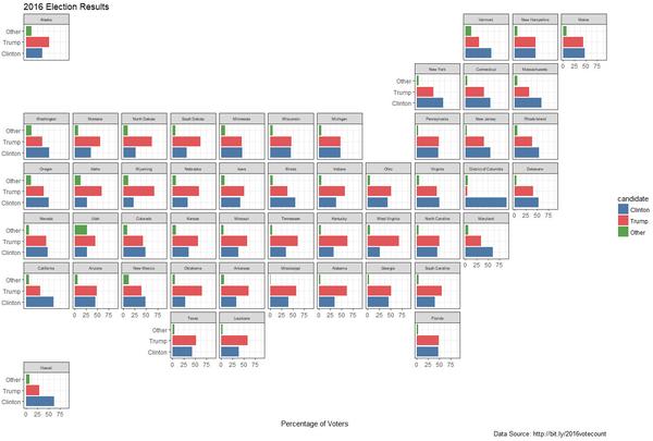

好了就写这几个吧,看完是不是觉得这个包很牛掰啊哈哈哈~_~
我也是被他给惊艳到才立马写出来分享给大家,不过可惜的是这些只能使用内建数据,如果你要呈现的地域包含在内建的地区里面,应该是可以用的,但是内部没有定义的地区编码,需要自己使用JS编辑器定义、提交、审核,灰常麻烦,但是我有信心把源码搞明白,然后写一套可以自定义的地区分面系统。(不知道要猴年马月才能出来哈哈哈~)
联系方式:
微信:ljty1991
博客主页:raindu's home
个人公众号:数据小魔方(datamofang)
团队公众号:EasyCharts
qq交流群:[魔方学院]298236508