
FlexboxLayout的使用说明书

概念
google开源的一套解决复查布局的控件,可以替换Anddroid里的LinearLayout+RelativeLayout,
最重要差异在于 FlexboxLayout 具有 “换行” 的特性,可便捷的写出流式布局,功能类似于CSS中的Flexbox。
场景
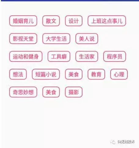

以上这种场景,以前一般都会使用ListView或RecycleView或者第三方自动换行控件+ Adapter去实现,实现的代码量稍微有点大。
而现在有了这个FlexboxLayout,实现起来特别简单,代码量也大大的减少了很多,下面看看FlexboxLayout如实实现以上场景
使用
安装配置
bulid.gradle文件(module)
dependencies {
    compile 'com.google.android:flexbox:0.2.6'
 }
实现
xml实现
<?xml version="1.0" encoding="utf-8"?>
<com.google.android.flexbox.FlexboxLayout xmlns:android="http://schemas.android.com/apk/res/android"
    xmlns:app="http://schemas.android.com/apk/res-auto"
    android:layout_width="match_parent"
    android:layout_height="wrap_content"
    app:flexDirection="row"
    app:justifyContent="space_around"
    app:flexWrap="wrap">
    <TextView
        android:padding="6dp"
        android:layout_width="wrap_content"
        android:layout_height="wrap_content"
        android:background="@drawable/shape_text"
        android:text="吃货"
        android:layout_marginBottom="10dp"/>
    <TextView
        android:layout_marginBottom="10dp"
        android:padding="6dp"
        android:layout_width="wrap_content"
        android:layout_height="wrap_content"
        android:background="@drawable/shape_text"
        android:text="逗比" />
    <TextView
        android:layout_marginBottom="10dp"
        android:padding="6dp"
        android:layout_width="wrap_content"
        android:layout_height="wrap_content"
        android:background="@drawable/shape_text"
        android:text="创业者" />
    <TextView
        android:layout_marginBottom="10dp"
        android:padding="6dp"
        android:layout_width="wrap_content"
        android:layout_height="wrap_content"
        android:background="@drawable/shape_text"
        android:text="上班这点事" />
    <TextView
        android:layout_marginBottom="10dp"
        android:padding="6dp"
        android:layout_width="wrap_content"
        android:layout_height="wrap_content"
        android:background="@drawable/shape_text"
        android:text="影视天堂" />
    <TextView
        android:layout_marginBottom="10dp"
        android:padding="6dp"
        android:layout_width="wrap_content"
        android:layout_height="wrap_content"
        android:background="@drawable/shape_text"
        android:text="大学生活" />
    <TextView
        android:padding="6dp"
        android:layout_marginBottom="10dp"
        android:layout_width="wrap_content"
        android:layout_height="wrap_content"
        android:background="@drawable/shape_text"
        android:text="单身狗" />
    <TextView
        android:padding="6dp"
        android:layout_marginBottom="10dp"
        android:layout_width="wrap_content"
        android:layout_height="wrap_content"
        android:background="@drawable/shape_text"
        android:text="运动和健身" />
    <TextView
        android:layout_marginBottom="10dp"
        android:padding="6dp"
        android:layout_width="wrap_content"
        android:layout_height="wrap_content"
        android:background="@drawable/shape_text"
        android:text="网购达人" />
    <TextView
        android:layout_marginBottom="10dp"
        android:padding="6dp"
        android:layout_width="wrap_content"
        android:layout_height="wrap_content"
        android:background="@drawable/shape_text"
        android:text="旅游" />
    <TextView
        android:layout_marginBottom="10dp"
        android:padding="6dp"
        android:layout_width="wrap_content"
        android:layout_height="wrap_content"
        android:background="@drawable/shape_text"
        android:text="程序员" />
    <TextView
        android:layout_marginBottom="10dp"
        android:padding="6dp"
        android:layout_width="wrap_content"
        android:layout_height="wrap_content"
        android:background="@drawable/shape_text"
        android:text="追星族" />
    <TextView
        android:layout_marginBottom="10dp"
        android:padding="6dp"
        android:layout_width="wrap_content"
        android:layout_height="wrap_content"
        android:background="@drawable/shape_text"
        android:text="短片小说" />
    <TextView
        android:layout_marginBottom="10dp"
        android:padding="6dp"
        android:layout_width="wrap_content"
        android:layout_height="wrap_content"
        android:background="@drawable/shape_text"
        android:text="美食" />
    <TextView
        android:layout_marginBottom="10dp"
        android:padding="6dp"
        android:layout_width="wrap_content"
        android:layout_height="wrap_content"
        android:background="@drawable/shape_text"
        android:text="教育" />
<TextView
        android:layout_marginBottom="10dp"
        android:padding="6dp"
        android:layout_width="wrap_content"
        android:layout_height="wrap_content"
        android:background="@drawable/shape_text"
        android:text="学生党" />
<TextView
        android:layout_marginBottom="10dp"
        android:padding="6dp"
        android:layout_width="wrap_content"
        android:layout_height="wrap_content"
        android:background="@drawable/shape_text"
        android:text="汪星人" />
</com.google.android.flexbox.FlexboxLayout>
即把所有子控件写到最外层是FlexboxLayout的里面即可
效果:
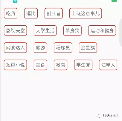
代码实现
public class CodeActivity extends AppCompatActivity {

    String[] tags = {"吃货", "逗比", "创业者", "上班这点事儿",
            "影视天堂", "大学生活", "单身狗", "运动和健身",
            "网购达人", "旅游", "程序员", "追星族", "短篇小说",
            "美食", "教育", "学生党", "汪星人"};

    @Override
    protected void onCreate(Bundle savedInstanceState) {
        super.onCreate(savedInstanceState);
        setContentView(R.layout.code_layout);

        FlexboxLayout flexboxLayout =
        (FlexboxLayout) findViewById(R.id.flexbox_layout);

        for (int i = 0;i < tags.length;i++) {
            LinearLayout layout = (LinearLayout) LayoutInflater.from(this)
            .inflate(R.layout.textview,null);
            TextView textview = (TextView) layout.findViewById(R.id.textview);
            textview.setText(tags[i]);
            flexboxLayout.addView(layout);
        }

    }

}
效果
属性讲解
接下来,以一个简单的demo来分析FlexboxLayout里经常用到的属性
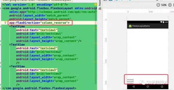
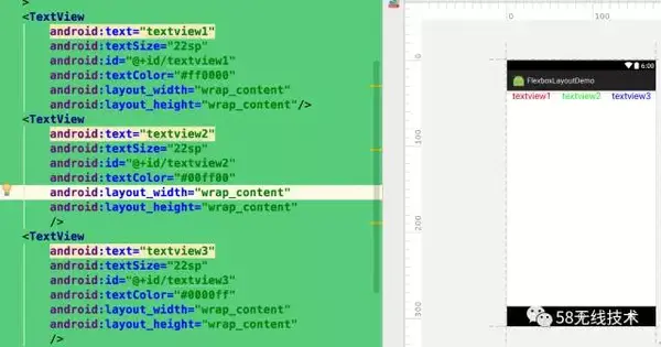
直接在布局最外层加入,如下:
<?xml version="1.0" encoding="utf-8"?>
<com.google.android.flexbox.FlexboxLayout
xmlns:android="http://schemas.android.com/apk/res/android"
android:layout_width="match_parent"
android:layout_height="match_parent">
<TextView
android:text="textview1"
android:id="@+id/textview1"
android:layout_width="wrap_content"
android:layout_height="wrap_content"/>
<TextView
android:text="textview2"
android:id="@+id/textview2"
android:layout_width="wrap_content"
android:layout_height="wrap_content"/>
<TextView
android:text="textview3"
android:id="@+id/textview3"
android:layout_width="wrap_content"
android:layout_height="wrap_content"
/>
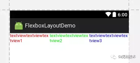
</com.google.android.flexbox.FlexboxLayout>咱们先看下没有添加额外属性(FlexboxLayout的属性)的效果

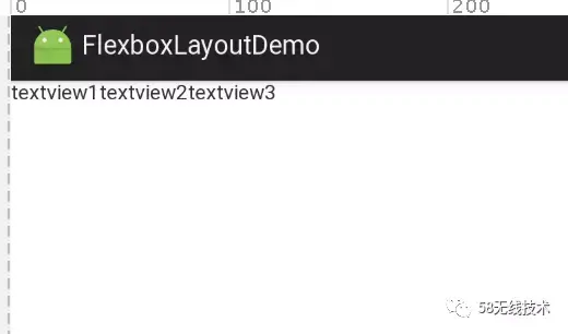
跟LinearLayout一样,默认是水平方向的
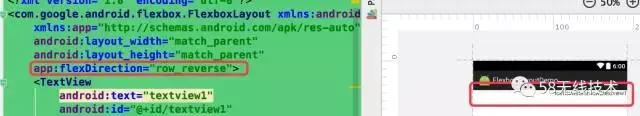
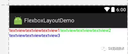
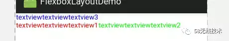
flexDirection(方向属性)
类似 LinearLayout 的 vertical 和 horizontal
值说明备注row默认值,主轴为水平方向,起点在左端
row-reverse主轴为水平方向,起点在右端
column主轴为垂直方向,起点在上沿
column-reverse主轴为垂直方向,起点在下沿


flexWrap(换行属性)
默认情况下 Flex 跟 LinearLayout 一样,都是不带换行排列的,但是flexWrap属性可以支持换行排列
值说明备注nowrap不换行
wrap按正常方向换行
wrap-reverse按反方向换行
我们把上面的demo加上该属性试试,首先我们先把水平方向填满

然后分别加上flexWrap属性,值为wrap,wrap-reverse

发现两个都换行了,而且reverse的时候,是最后添加的text3在最上面
justifyContent
值说明备注flex-start默认值,左对齐
flex-end右对齐
center居中
space-between两端对齐,项目之间的间隔都相等
space-around每个项目两侧的间隔相等。所以,项目之间的间隔比项目与边框的间隔大一倍

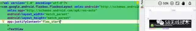

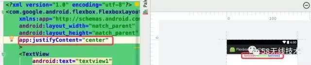
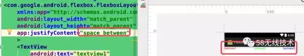
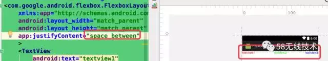

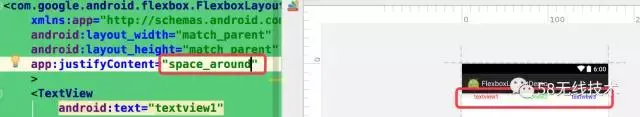

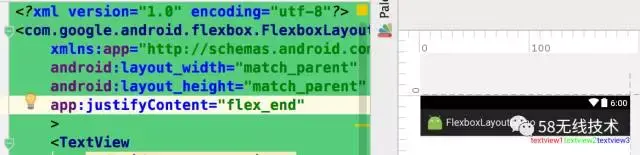
可以看到前三个属性类似gravity,而后两个类似于LinearLayout里的weight属性
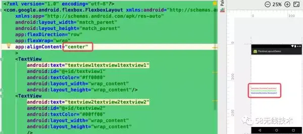
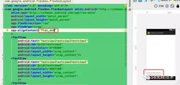
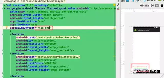
alignContent
属性定义项目在交叉轴上如何对齐
值说明备注flex-start交叉轴的起点对齐
flex-end交叉轴的终点对齐
center交叉轴的中点对齐
baseline项目的第一行文字的基线对齐
stretch默认值,如果项目未设置高度或设为auto,将占满整个容器的高度
这里解释下什么是主/交叉轴,看图:
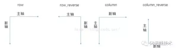
图中的副轴即为交叉轴
这个属性什么情况下起作用呢?
当主轴是水平方向时,只有存在多行的情况下,这个属性才起作用,如图:


添加了没有任何效果,现在换成多行试试:

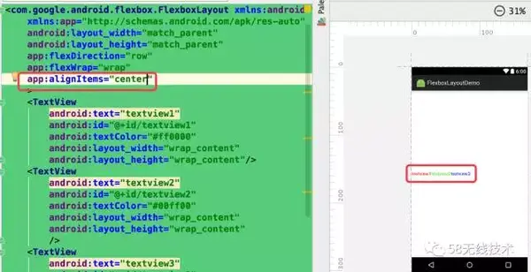
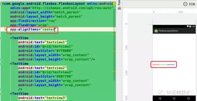
alignItems
与aliginConent属性的区别在于单行的情况下也生效
值说明备注flex-start交叉轴的起点对齐
flex-end交叉轴的终点对齐
center交叉轴的中点对齐
baseline项目的第一行文字的基线对齐
stretch默认值,如果项目未设置高度或设为auto,将占满整个容器的高度
子控件属性
—被包裹在FlexboxLayout布局里控件的属性
layout_order
值说明备注数字这个属性主要用于子控件的,可以控制排列的顺序,负值在前,正值在后,按照从小到大的顺序依次排列
看下添加该属性前后的效果对比图

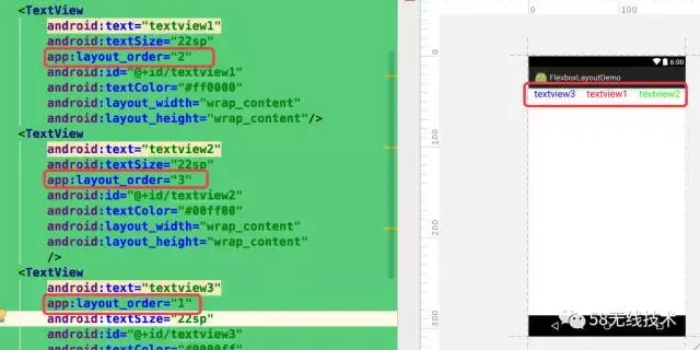

由效果图可以看到该属性决定这子控件所在的位置顺序的
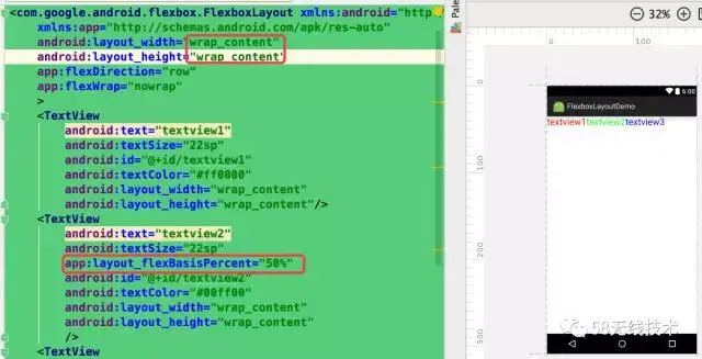
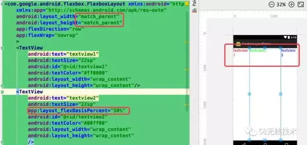
layout_flexBasisPercent
值说明备注百分数
该属性只有在父布局为MeasureSpec.EXACTLY(
wrap_parent -> MeasureSpec.AT_MOST
match_parent -> MeasureSpec.EXACTLY
具体值 -> MeasureSpec.EXACTLY)时生效,设置三个模式看下效果
wrap_parent(没有效果)
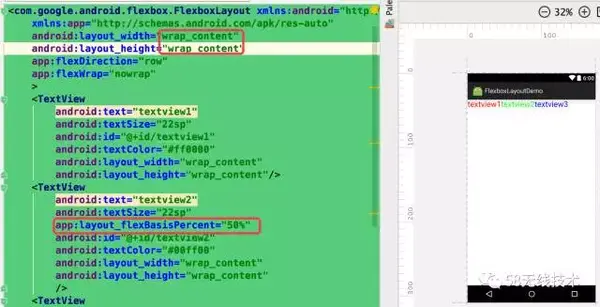
match_parent(有效果)

指定值(有效果)

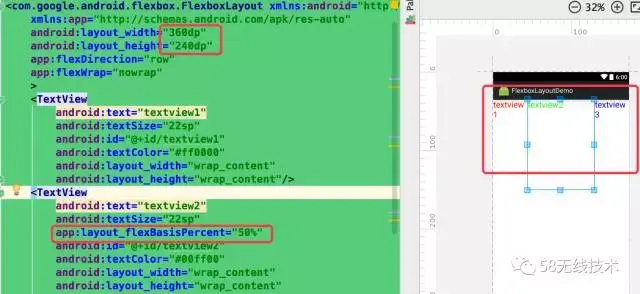
可以看到当父布局为match或者固定值时,子控件设置的该属性会起作用(占屏幕的50%)
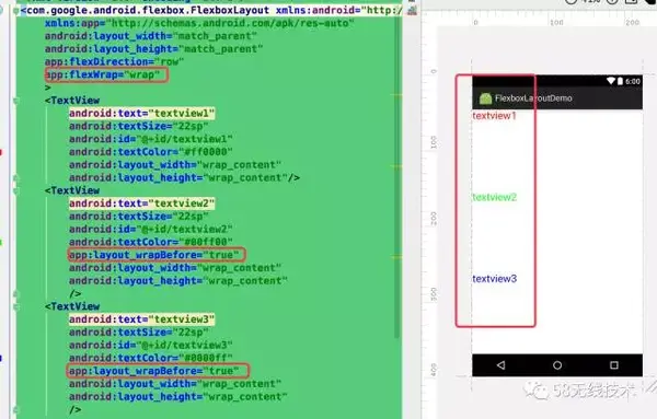
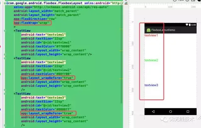
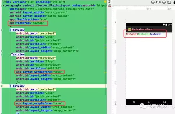
layout_wrapBefore
值说明备注true/falseitem是否在 flex line 的第一个,默认为 false,在父布局app:flexWrap=”nowrap”时不起作用
item 是否在 flex line 的第一个,默认为 false,
在父布局app:flexWrap=”nowrap”时不起作用
对比下设置的效果

总结
优点:
- 具有LinearLayout的功能,除了能自动换行外,还具有LinearLayout与RelativeLayout没有的一些属性
缺点:
- 不具有RelativeLayout的一些属性,比如layout_alignParentBottom=”true”
- 从过度绘制与帧率上看,与LinearLayout/RelativeLayout没有多大区别,有兴趣的同学可以写一个复杂的界面对比下。
适用场景
- 自动换行
- 流式布局(子布局方向一致的)
问题
FlexboxLayout的targetSdkVersion=25
参考